Kofeina24 approached us with the need to refresh its brand image and create a modern, intuitive website. The main goal was to modernize the visual identity, improve user experience, and stand out from the competition.
Problems in the Old Design
The previous website and packaging design had a raw, dark character that did not reflect the product’s energy and dynamism. The black and turquoise color scheme was contrasting but lacked cohesion. The website did not meet modern UX/UI standards, and the brand’s key values were not effectively highlighted.
Solution – New Branding and Website
We carried out a comprehensive rebranding for Kofeina24, which included:
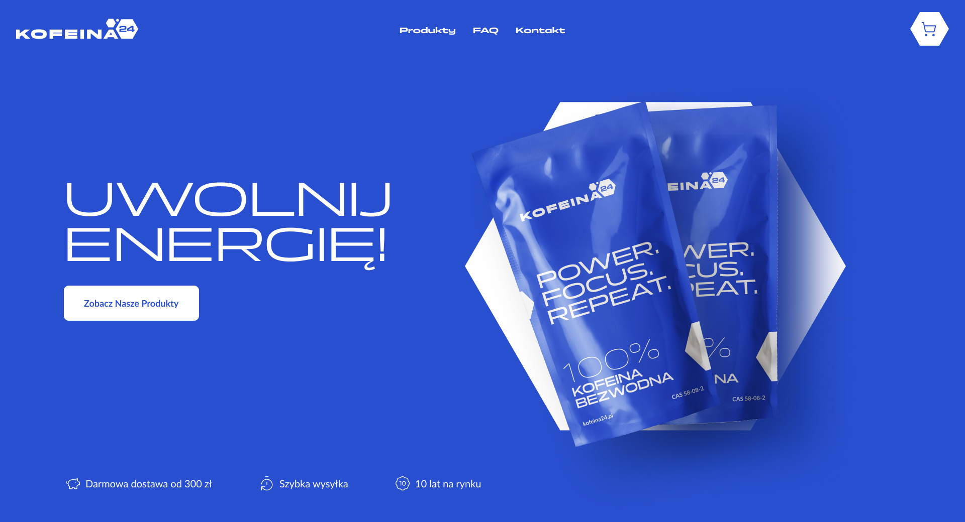
New visual identity – an intense blue color, associated with energy, sports, and dynamism. The modern typography emphasizes precision and effectiveness.
New logo – inspired by the chemical structure of caffeine, reinforcing the brand's image as an expert.
New packaging design – clear and modern, featuring the slogan "Power. Focus. Repeat." to highlight the product's key benefits.
New website – clean design with intuitive navigation, optimized calls to action, and a simplified purchasing process.
New logo
Results
Increased brand recognition – The new color scheme and branding make Kofeina24 stand out in the market.
Higher conversion rates – Clearer communication and a simplified purchasing process encourage customers to complete transactions.
Consistent brand messaging – From packaging to the website, the brand now presents a cohesive and dynamic image.
Packaging concept
Nowa strona WWW (Sekcja hero)
Summary
Thanks to the rebranding, Kofeina24 has gained a modern, distinctive look that better reflects the energy and effectiveness of its products.
Working with Funhaus was a perfect match. The new look of Kofeina24 outstanding – modern, dynamic, and finally aligned with our product. The website design looks amazing. The results exceeded our expectations!


.svg)


.svg)


